
Going Big and Bold in a Lakeshore Home
Story by Karen Paton-Evans
Photography by Michael Pietrangelo
Five skilled weavers in Nepal sat side by side weaving for an entire year to craft a 9’ by 12’ rug commissioned for a Lakeshore home. Blending 60 percent silk with 40 percent wool yarn, the weavers handtied 100 knots per square inch. “They finished an inch a day,” says Tim O’Neill.
He is the designer who brought a photo and a tiny sample of the vibrant, contemporary rug to his clients, a couple looking to infuse pizzazz into the house they purchased 20 years earlier.
“The homeowners loved the rug – the “Atlantis Aqua” design made by Tufenkian Artisan Carpets. They also appreciated the company’s humanitarian mandate. While the rug was being woven, we couldn’t create the home’s new colour scheme because we didn’t have the actual rug to coordinate with its 36 beautiful colours.”
Tim and his wife and co-designer Stephanie Harrington-O’Neill were not idle during those long months, however. Back in their Windsor studio, O’Neill-Harrington Interiors, they continued to source distinctive finishes, furnishings and accent pieces for their adventurous clients.
The homeowners’ direction to their design team was straightforward: “Let’s get exciting and have some impact with this remodel.”
“They were open to trying different things,” says Tim, who was eager to deliver.
After the thrill of ordering the rug, the next step was simplicity itself. “I took down the existing window valances and blinds. We wanted the windows clean and open,” Tim says. “The homeowners live in a wooded spot on Lake St. Clair and can’t see their neighbours.” Viewed through the windows, the trees and water provide living artwork that changes seasonally.
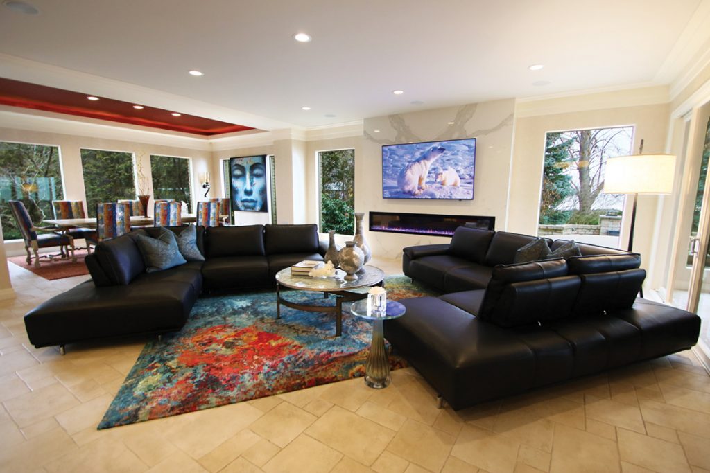
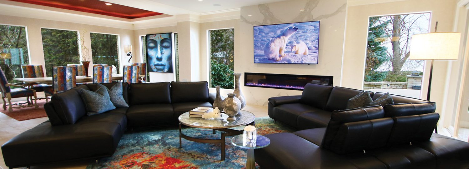
The remodeled great room of a Lakeshore home goes bold, with a vibrant rug from Nepal and Italian black leather sectionals. 
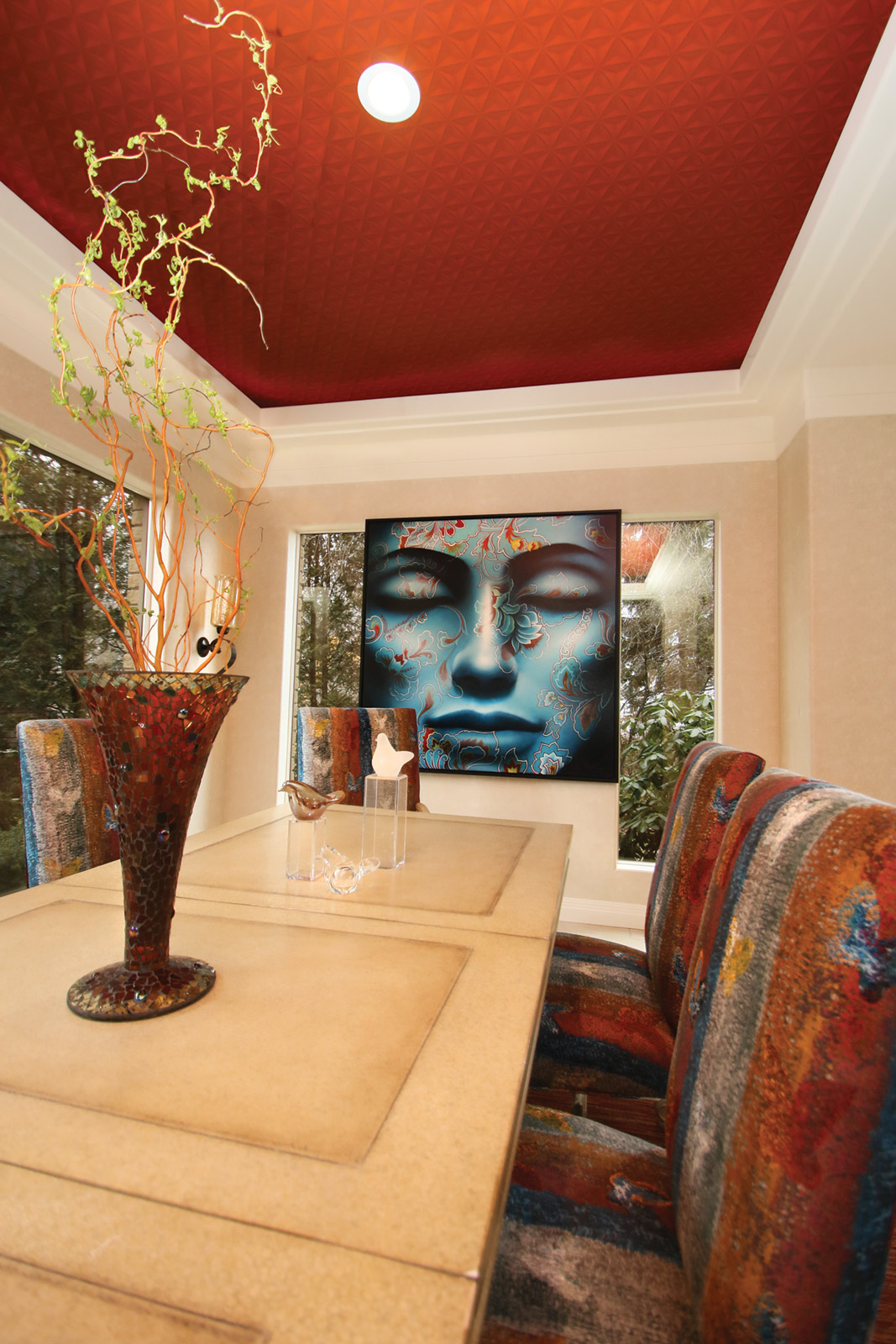
Taking its cue from the great room’s rug, the dining area glows with a burnt red ceiling, multihued Parsons chairs and the painting of a blue tranquil woman. 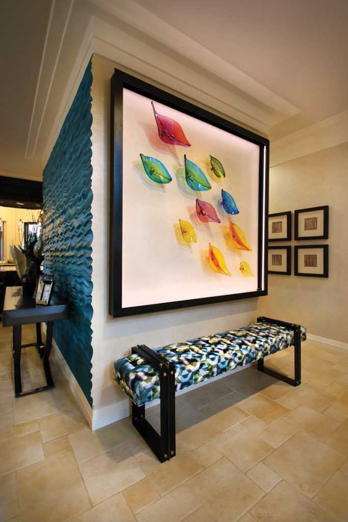
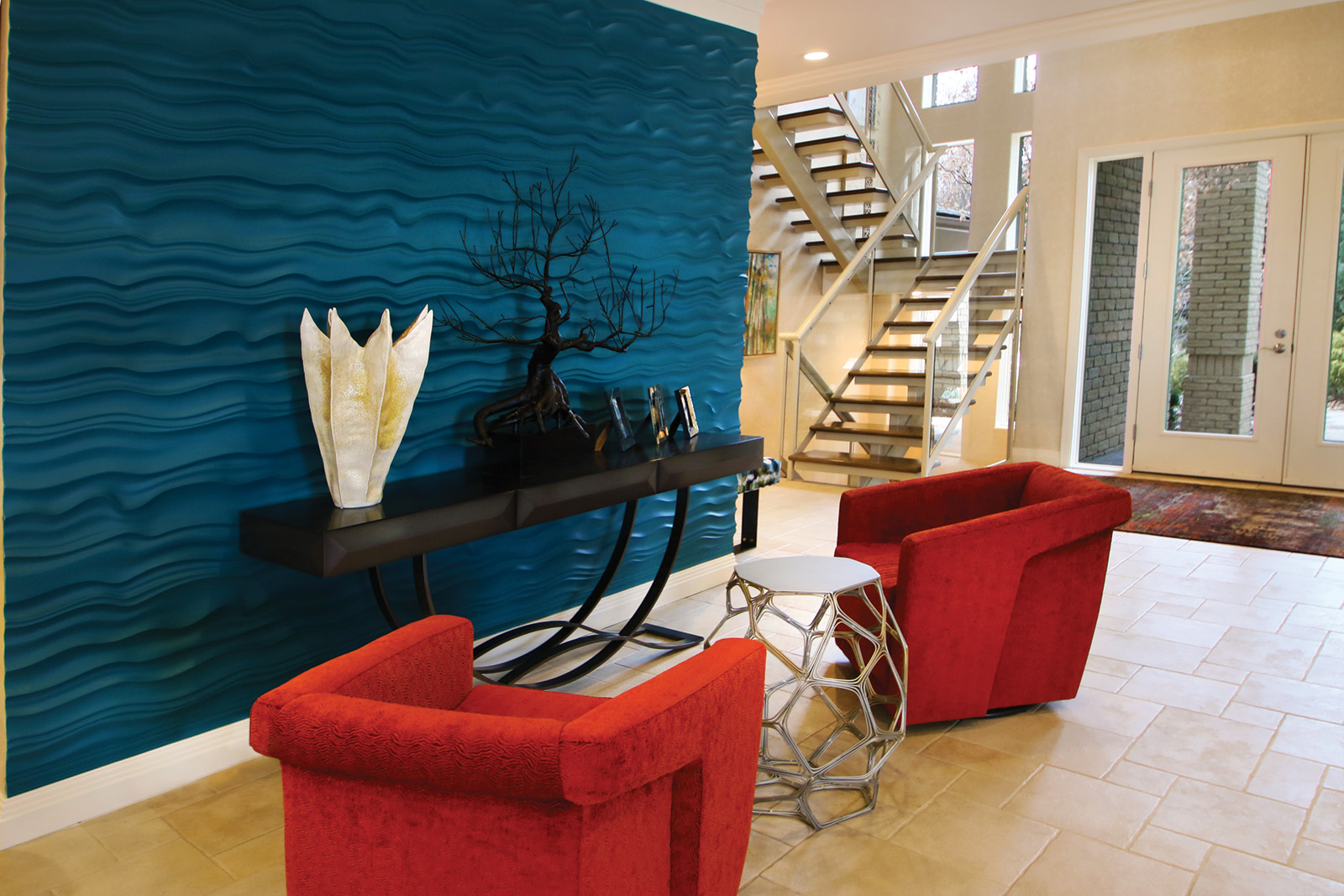
Colourful glass leaves crafted by Tsunami Glassworks in Windsor float across the foyer’s feature wall. 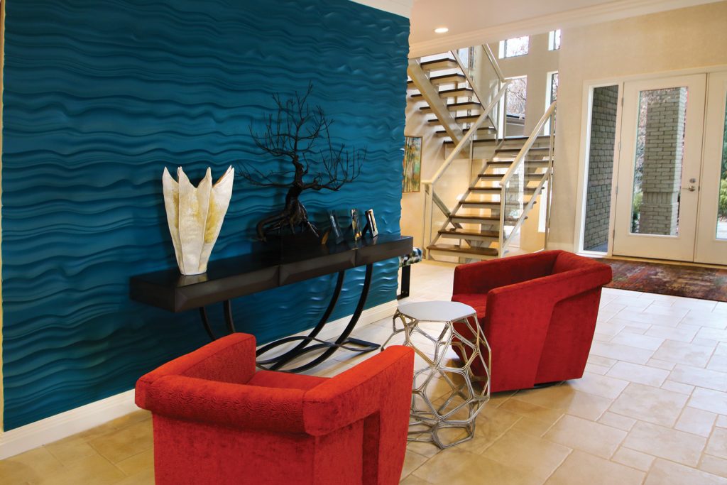
The waves of Lake St. Clair lapping at the property’s edge are mimicked by the feature wall’s blue waves.


A quiet backdrop was then established to permit the rug and accents to pop. Pale ivory honed travertine tiles cover the floors of the open concept great room, kitchen, dining area and foyer. Most walls are painted in a light hue, capped by soft white crown moulding.
Rather than overwhelm the pale tones with a strong fireplace wall, two huge Calacatta ivory porcelain slabs with grey veining were book-matched and secured on the wall space between two windows. Warming the slabs is a new linear fireplace measuring 100” wide by 16” high, sending flames through blue fire glass. Above it, a TV screen can be viewed anywhere in the great room.
The optimal spot for binge watching, however, is on the twin two-piece sectionals flanking the area rug and set before the fireplace wall. Imported from Italy, the black Gamma leather sectional has a ratchet that adjusts the back. When watching TV, the homeowners open the sectional so it’s like a daybed. When entertaining, the back pulls forward, enabling guests to sit behind, on the end and in front. “It’s a great party sofa, letting you have conversations with people seated all around you,” Tim notes.
Bumping into the round coffee table won’t topple drinks onto the rug. Made in North Carolina, the heavy metal base and thick handblown architectural glass, 46” in diameter, add up to 300 pounds.
A daintier round pedestal side table has an elegant ribbed base of blue and gold blown glass and a crystal glass top. “It supports a crystal and porcelain vase that the wife fills with essential oil to infuse the room with scent,” Stephanie says.
The rug’s influence permeated the dining area at one end of the great room. The homeowners already had the table with a 4’ by 10’ faux limestone top on a wooden base. “We worked around that. Why get rid of something beautiful that we can update by changing the surrounding?” Tim points out.
Parsons chairs were covered in striped fabric with smudged lines in the rug’s primary hues. Defining the space, three dimensional trompe l’oeil Phillip Jeffries Wallpaper in burnt red was applied to the inset of the tray ceiling.
Casting serenity over the warm and lively setting is a huge oil painting of a woman’s face in blue: “Floreaux” by the artist Ngurah.
Burnt red was splashed onto two swivel upholstered armchairs arranged by a feature wall adjacent to the foyer. For the textured feature wall itself, the homeowners and designers all wanted a colour that packed punch.
Everyone loved the unpainted InterlockingRock 16” square dimensional panels made by modularArts. Composed of glass-reinforced cast rock with a foam core, 40 white panels were grouted together for a seamlessly sculpted look that resembles uneven waves.
“The homeowners were open to an accent colour borrowed from the rug. We came up with five options and debated for 10 days. Baltic blue won for its dramatic effect,” Tim says. Once the paint dried, the connection to the lake rippling at the edge of the yard was obvious. “It’s a major statement that relates beautifully to the setting.”
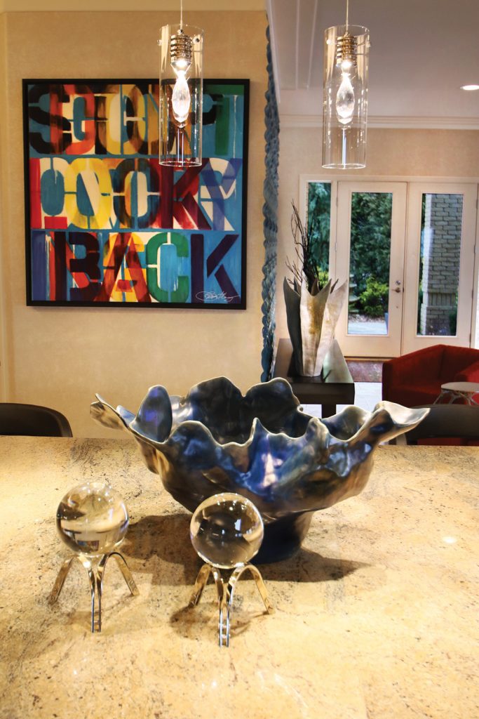
Living by their painting’s message: “Don’t Look Back” by artist Martin Bentley, the homeowners injected exciting pieces everywhere. 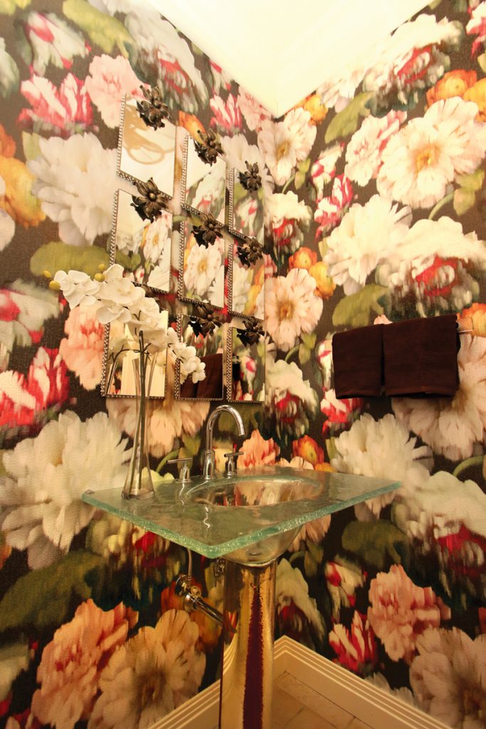
Flowery powder room with miniature mirrors and glass vanity. 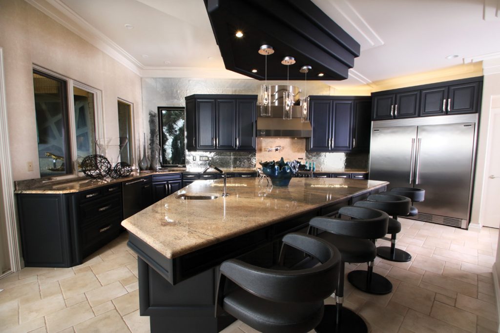
The shape of the low sheen black painted island is repeated in the black bulkhead above. For the backsplash, Ann Sacks Reveal rippled tiles create a blurred mirror effect that is easily cleaned. 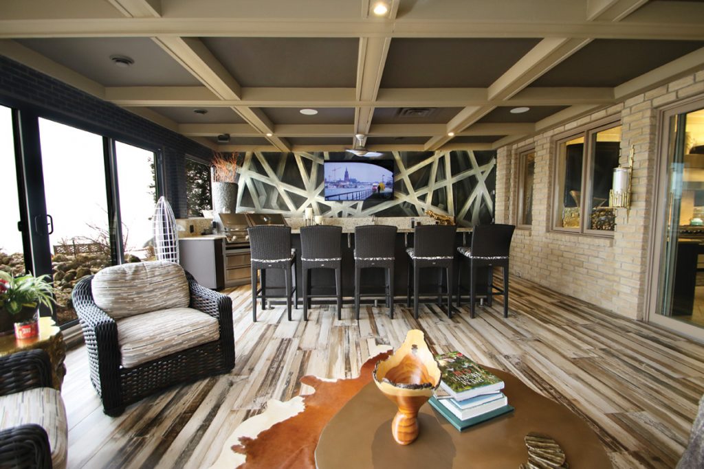
The bar area features a built-in barbecue and wine and standard fridges, ideal for entertaining.


Nature inspired the art on display in the foyer, where handblown glass leaves in the rug’s hues float within a stainless steel box frame. When the LED lighting strips lining the inside of the box are dimmed, the leaves glow. “This wonderful piece was made by Tsunami Glassworks in Windsor,” Tim says.
“The homeowners were really involved in selecting the artwork by local and international artists. I sent them to see works displayed at SHO Gallery and the Nancy Johns Gallery in Windsor and other spots. I’m happy that they shopped the real art galleries and purchased pieces by Catherine Bast, Jaclyn Abt, Shirley Williams and other respected, passionate artists,” says Tim. “They didn’t buy a piece because it matched the design and fit the space – they bought it because they loved it.”
“All of this was done because they wanted to feel and touch and look at it – the opposite of online shopping,” Stephanie says. “Seeing everything in person, there were no unpleasant surprises.”
The kitchen island provided another spot to display art: A huge vessel of fired glass, accompanied by two crystal balls on silver bases.
People turn into impressionist art when standing before the diamond- coloured backsplash stretching from the countertop to the ceiling. “You can see a shadow of yourself without any detail, reflected in the ripple finished Ann Sacks Reveal tile. It has a mirrored effect, achieved through a stain glass colour technique and annealing process,” Stephanie explains. “This Italian tile is really exotic – and functional. You’d never put a normal mirror on a backsplash because it’s going to get messy.”
A black painted low sheen finish was applied to the paneled kitchen cabinetry. Hand-chiseled stainless steel door pulls unify the backsplash and stainless appliances.
Heavier steel appears in the adjacent verandah. On the wall behind the bar, artist Lorraine Steele created a trompe l’oeil mural of flat steel bars bolted together, titled “Steel Girders.” “You’d swear it’s the real thing,” Stephanie says. A gold-plated tree stump holds drinks between resin wicker furniture. On the bar is a casting of a huge hollow crocodile head. “Imagine reaching into its mouth to get pretzels…it’s cool.”
Tim observes, “Design is fun when you and your clients get excited about details.”
Windsor Life Magazine is always searching for interesting homes, landscaping, gardens, patios and water features to show our readers what others in the community are doing with their living spaces. If you have a home that you feel would be interesting please email photos to publisher@windsorlife.com. Photos need to be for reference only. If your home is chosen we will arrange for a complete photo shoot. If you wish, you may remain anonymous and the location of your home will not be disclosed.

Add comment